PN.26.002. Branding. Studio project, 2026.
Maison Ondée
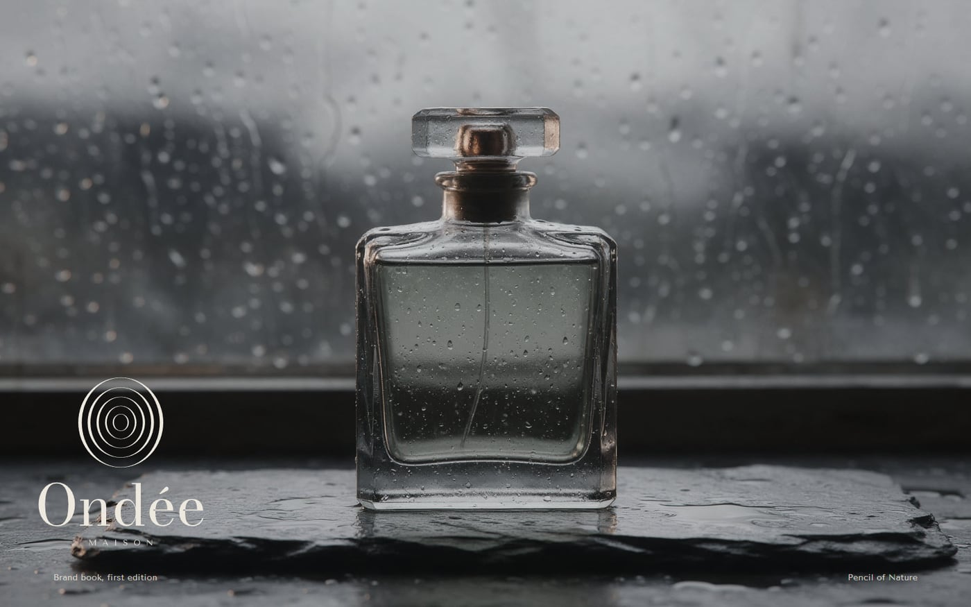
An identity for a Paris perfumer that bottles one thing: rain, at five different weights.
The brief
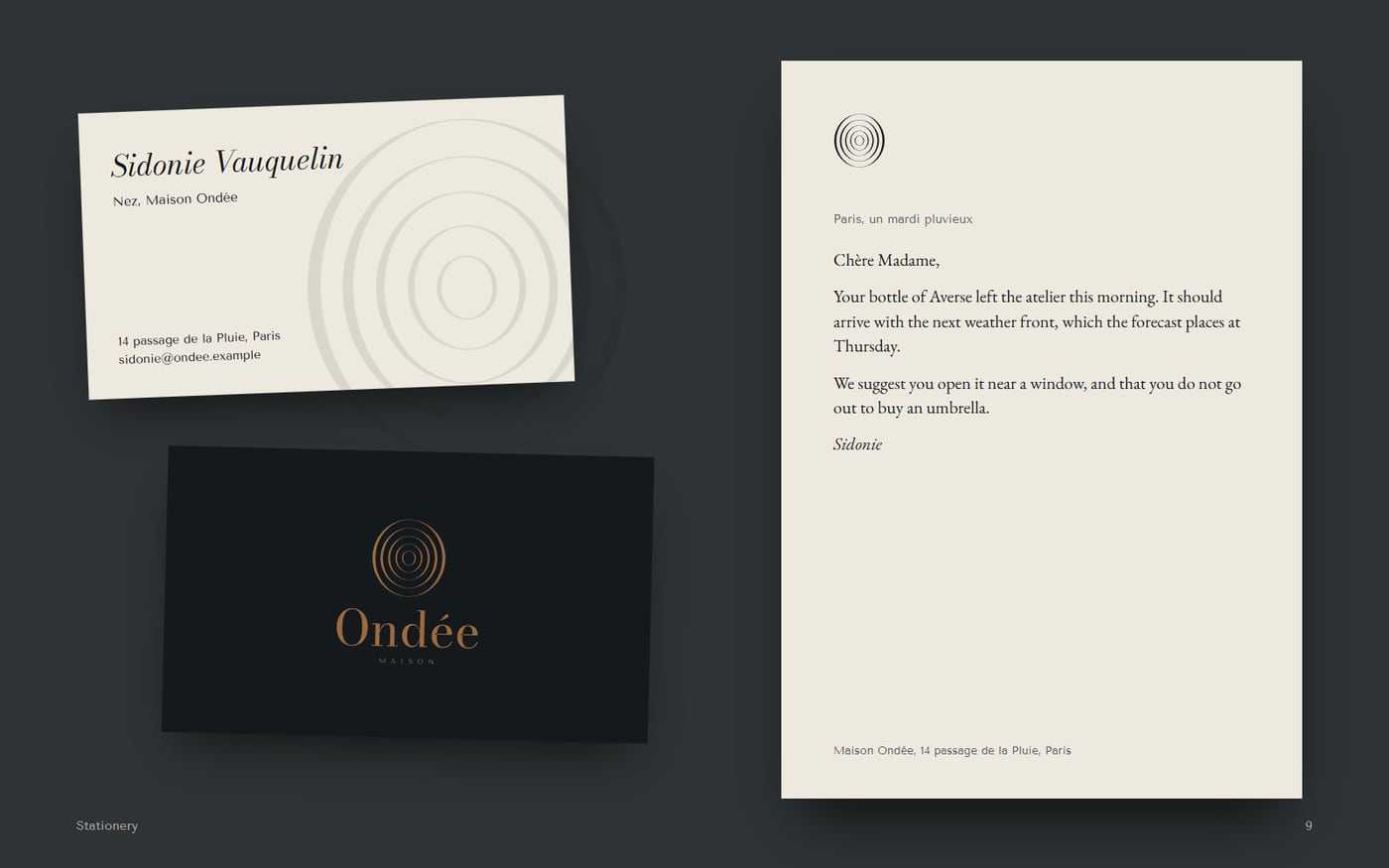
Create a complete luxury identity with a logo, colour system, typography, packaging, stationery, marketing graphics and guidelines. It must feel inherited, not launched.
The idea
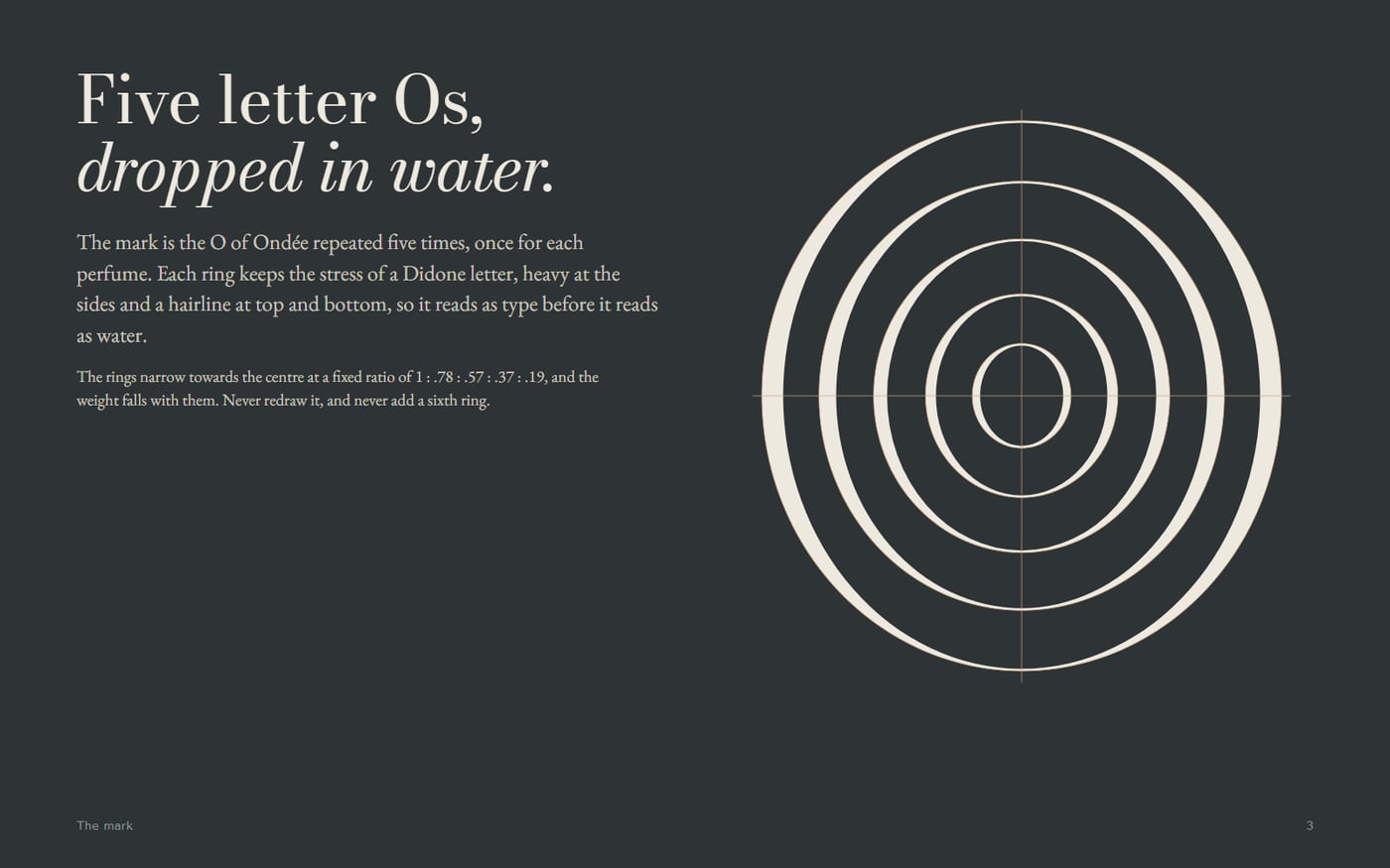
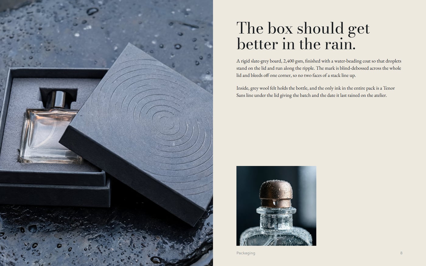
Rain is the most ordinary luxury there is. The house treats weather with the seriousness other perfumers give to oud, and its mark is the letter O of Ondée repeated five times like rings spreading on water.
Decisions
- The mark keeps Didone stress in every ring, so it reads as type first and water second.
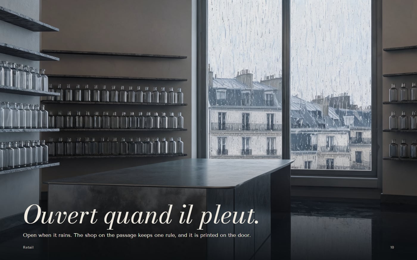
- One absurdly strict house rule, open only when it rains, does more for the brand than a page of adjectives.
- Five perfumes map to five rings, so the logo doubles as the product line.
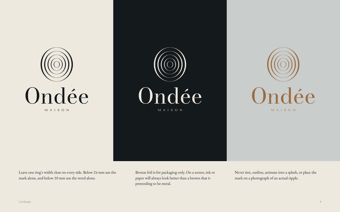
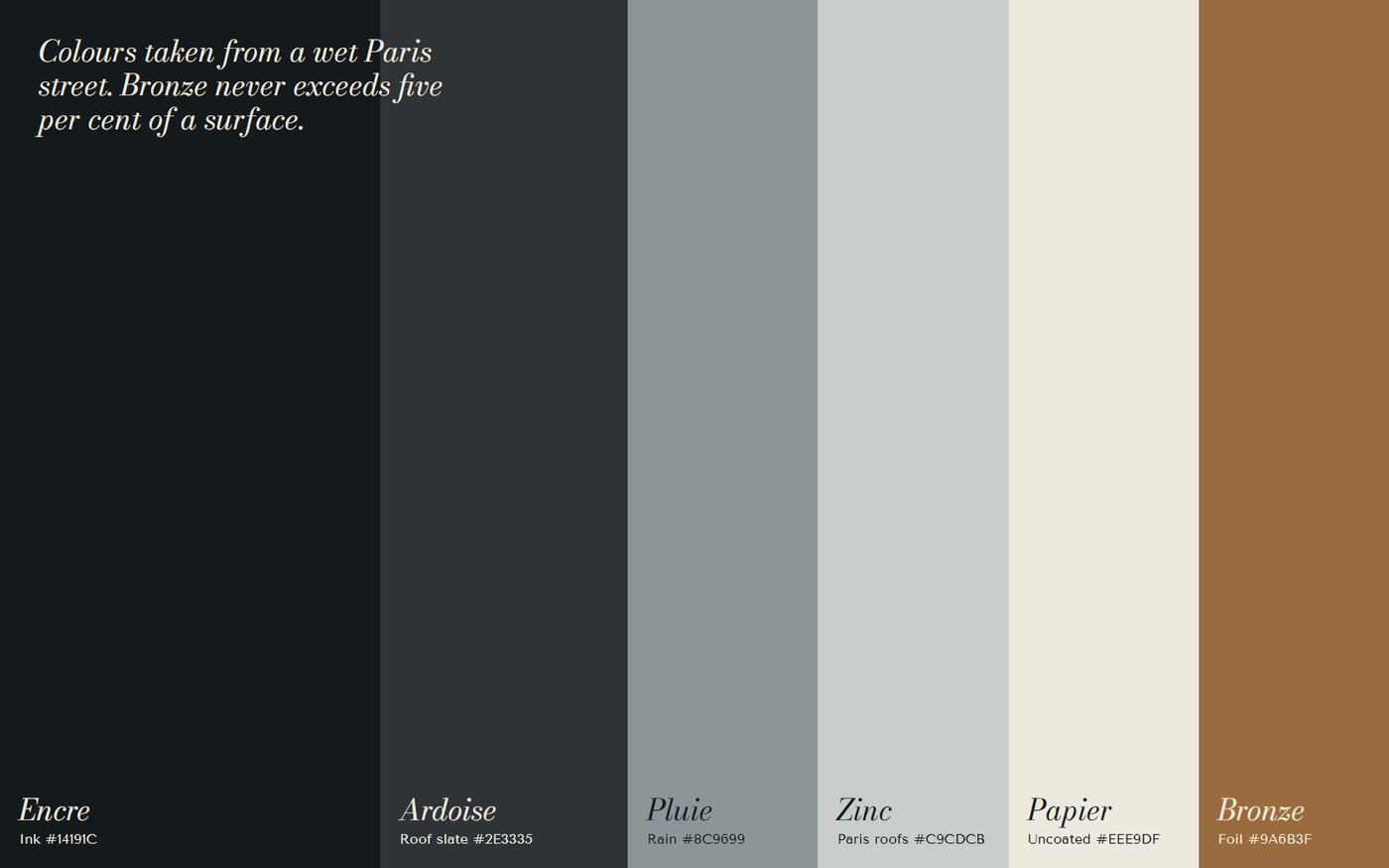
- Bronze is capped at five per cent of any surface, which is what keeps it feeling expensive.
How it came together
- Named the house after the French word for a sudden shower, and built the range around five weights of rain.
- Drew the mark as a script: nested ellipses with fixed ratios, exported as true outlines.
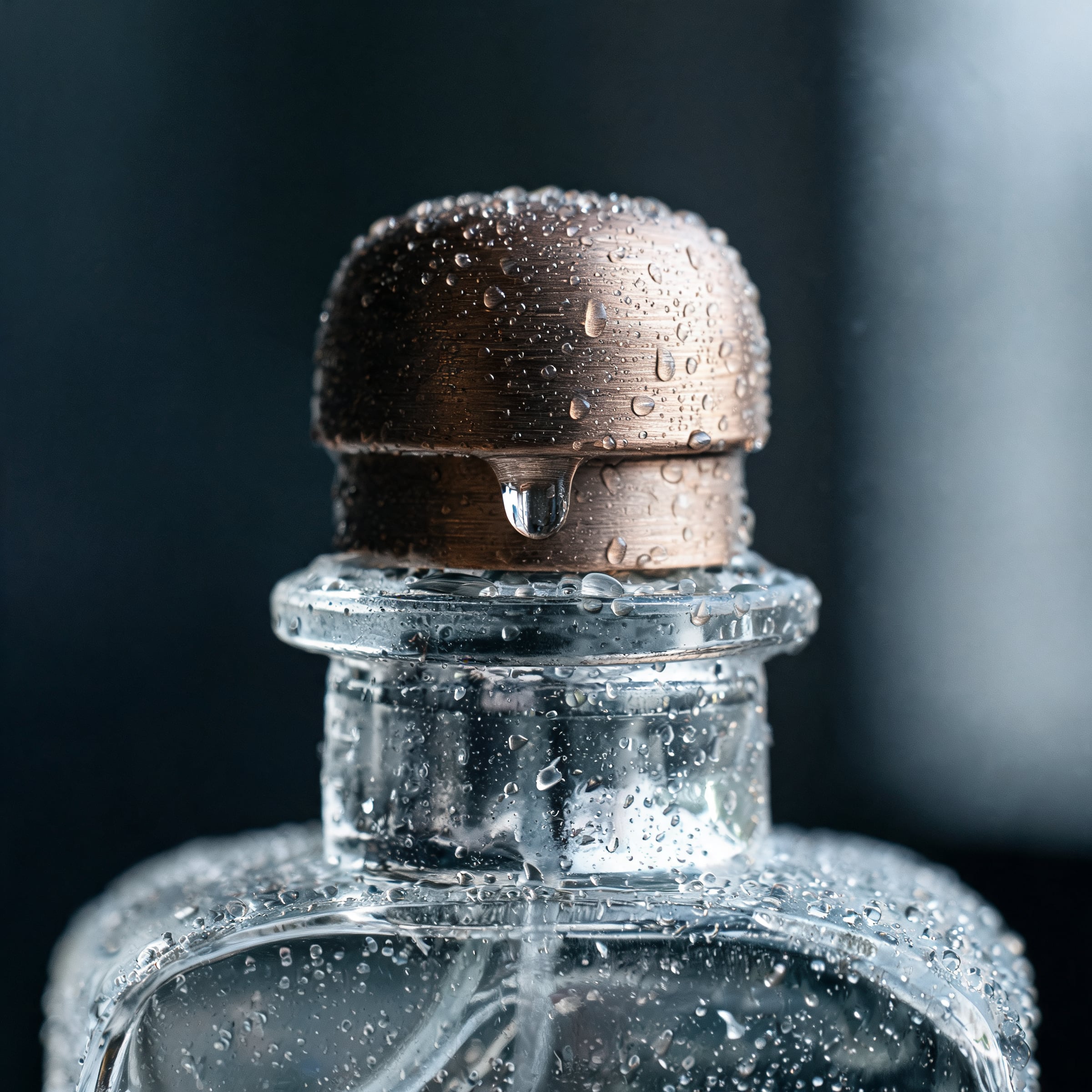
- Art-directed four images through a single colour brief so the set reads as one series.
- Set the book as twelve fixed spreads in HTML and printed it to PDF from Chrome.
How it works
A script builds the logo files, with wordmarks converted to outlines by opentype.js. The brand book is a single HTML document printed to PDF. Its construction diagram loads the same path data as the logo, so the two cannot drift apart.
Want something like this?
Tell us what you are making. A few lines is enough to start.
Hanging nearby
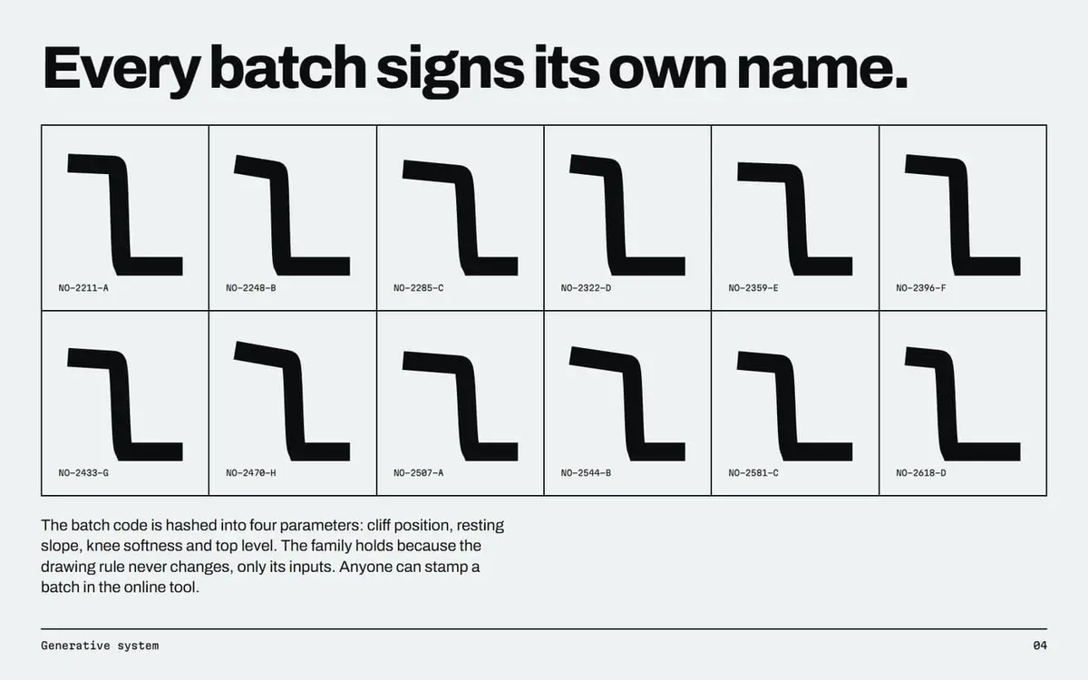
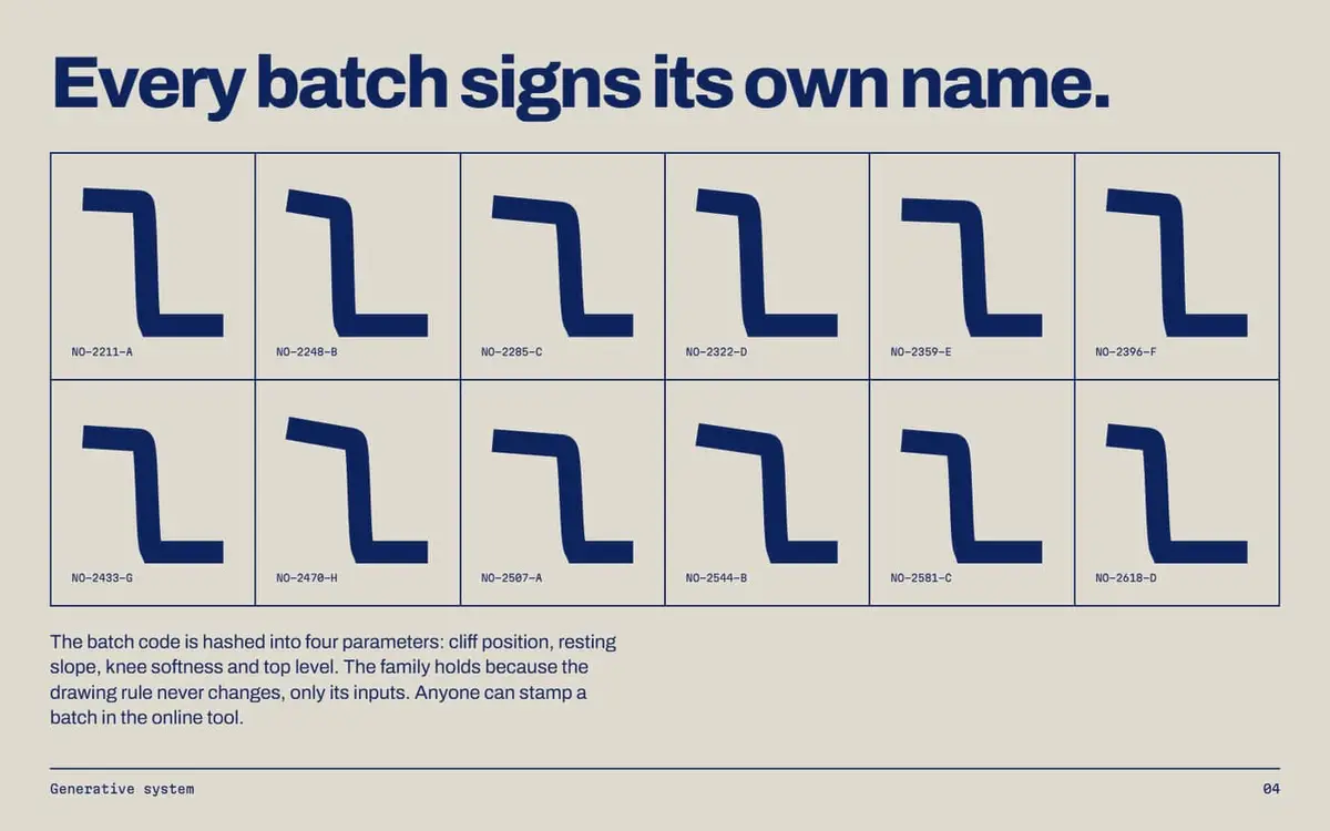 NullohmAn identity for a superconductor maker, where every cable batch stamps its own logo from its batch code.PN.26.008. Logo files, Brand book PDF.
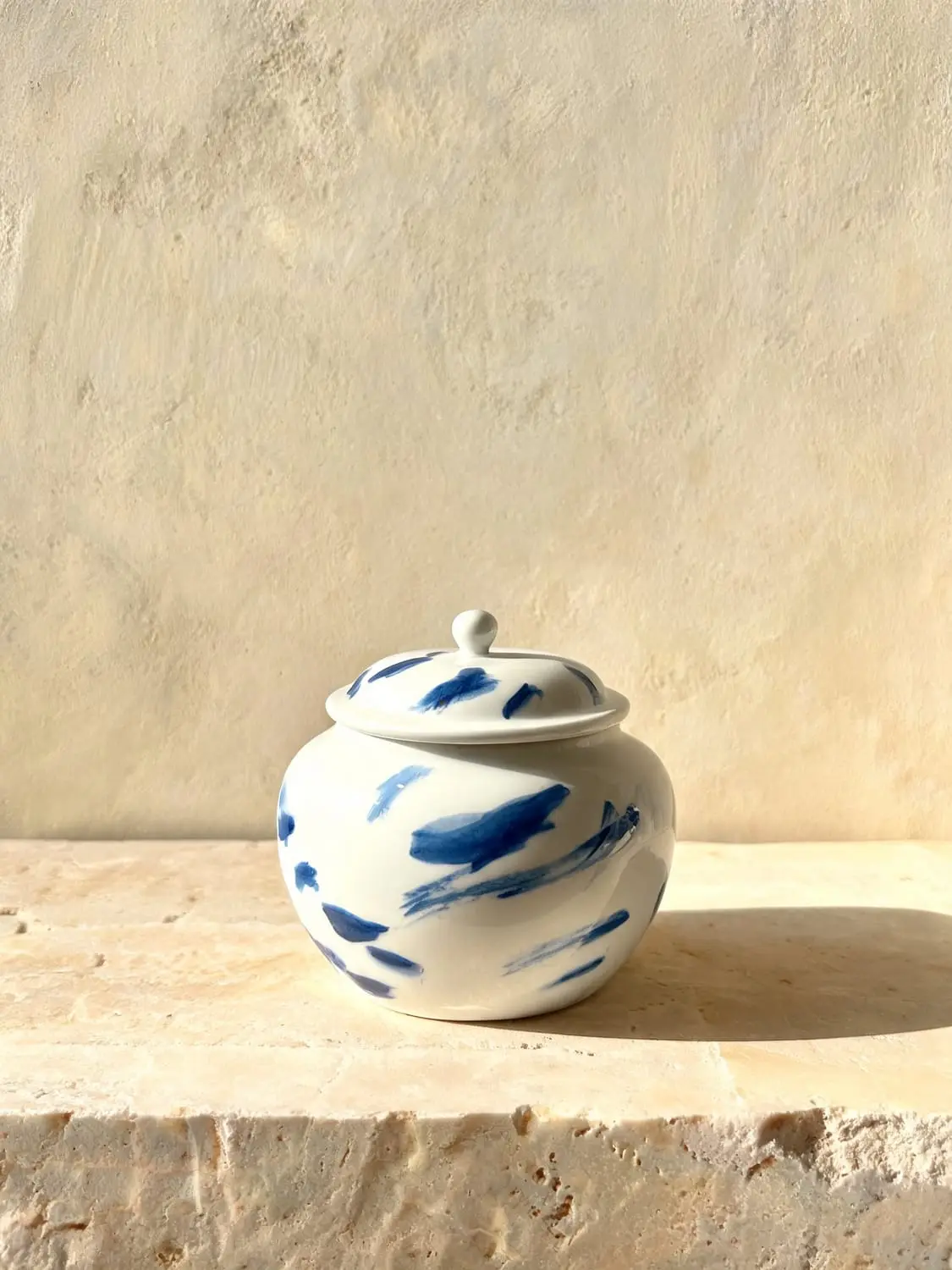
 Fornace OttaviaA luxury storefront for a Faenza kiln that fires eight times a year and closes when the shelf is empty.PN.26.009. Working website, Product imagery.
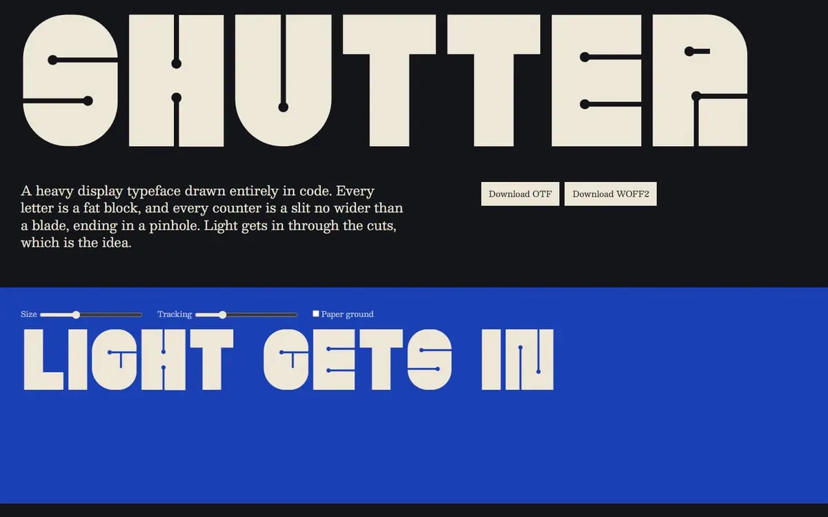
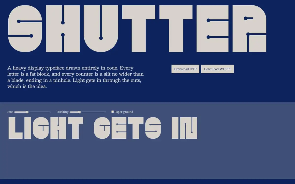 ShutterA real, installable typeface drawn entirely in code. Fat blocks with counters no wider than a blade, ending in a pinhole.PN.26.024. Font files, Specimen.