PN.26.008. Branding. Studio project, 2026.
Nullohm
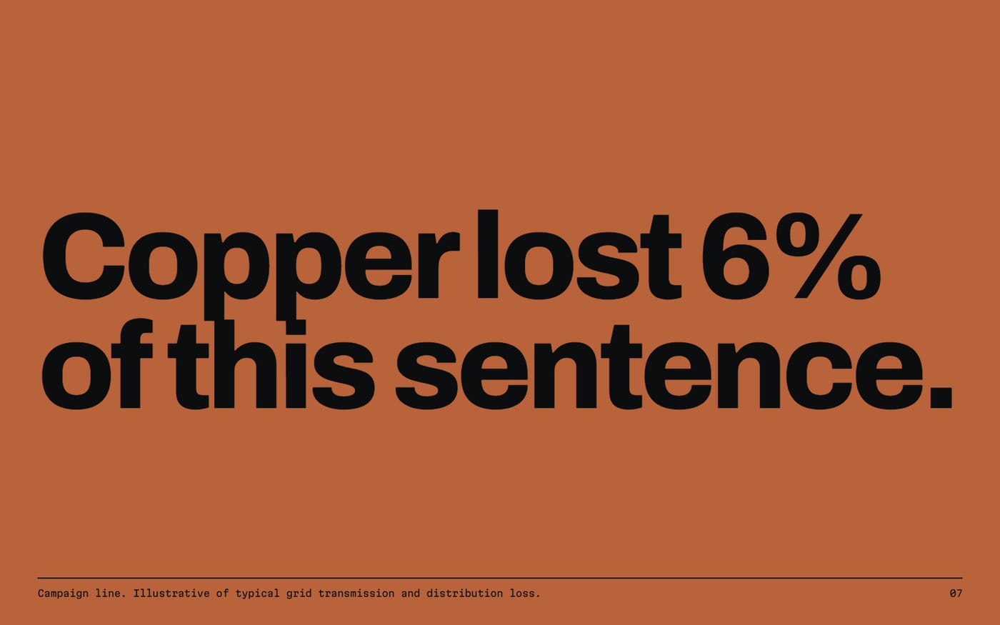
An identity for a superconductor maker, where every cable batch stamps its own logo from its batch code.
The brief
Create a futuristic technology brand with a visual system that contrasts completely with a luxury house: cold, modular and measured.
The idea
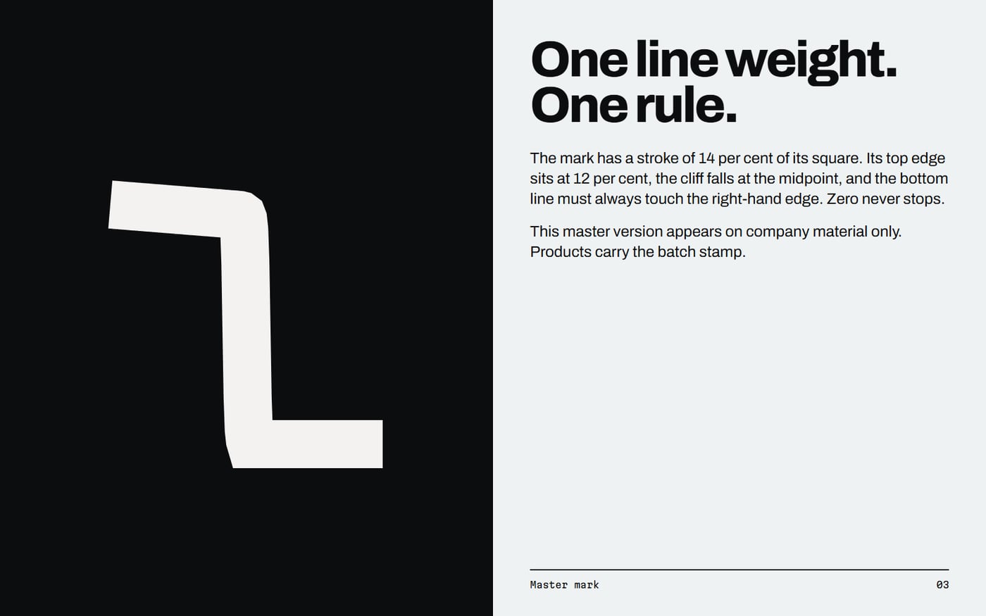
The logo is a graph. Below a critical temperature a superconductor's resistance collapses to zero, and that cliff is the mark. Copper, the metal the company replaces, is the only accent, and it only ever means loss.
Decisions
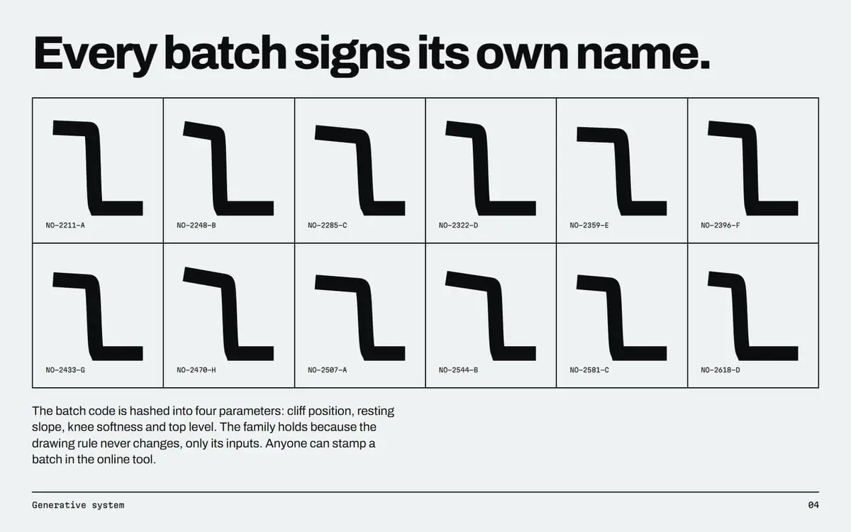
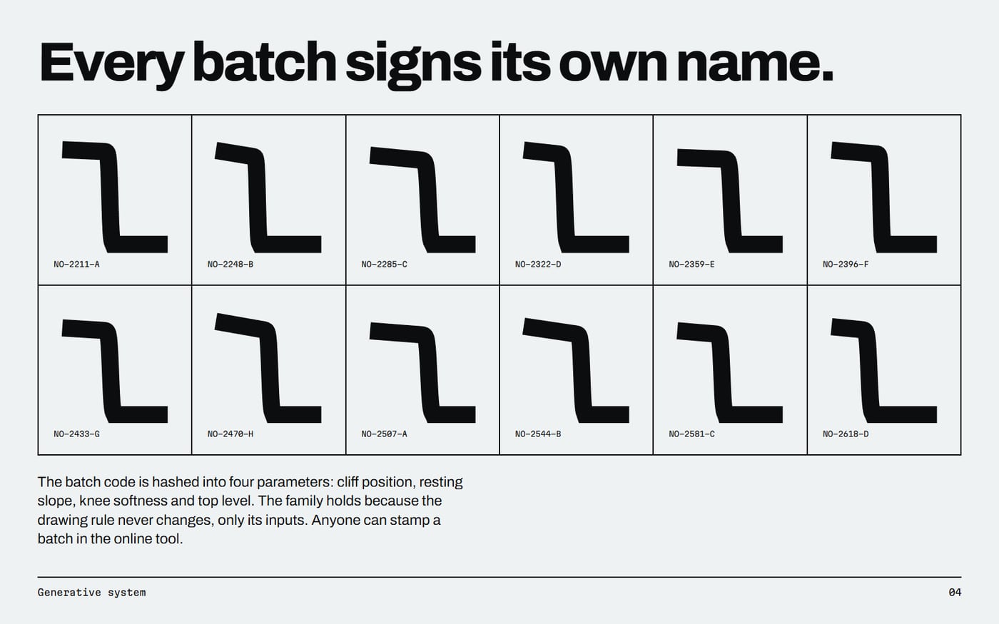
- A generative mark gives each drum its own signature while the drawing rule keeps the family intact.
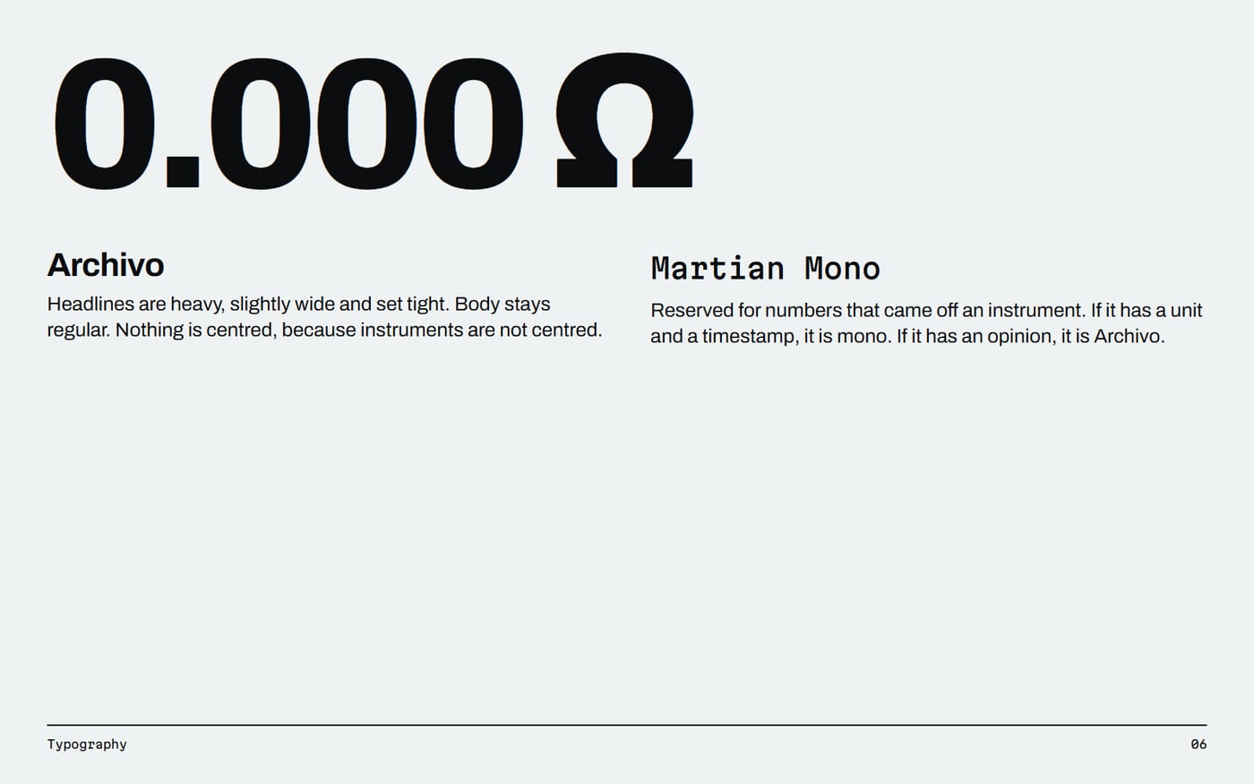
- Mono type is reserved for measured values, so typography itself separates evidence from opinion.
- Copper as the enemy turns a brand colour into an argument.
- No sparks or glow. Electricity doing its job is invisible, and that is the product.
How it came together
- Started from the physics: what single image proves the product works?
- Wrote the curve as a sigmoid with four parameters and hashed batch codes into them.
- Built the stamp tool, then let its output drive the staff card and drum label live.
- Printed the guidelines from the same code, so the book's marks are real output.
How it works
curve.js hashes a batch code into four parameters and draws the curve as a 240-point SVG path. The tool, the guidelines and the logo files all import that one module.
Want something like this?
Tell us what you are making. A few lines is enough to start.
Hanging nearby
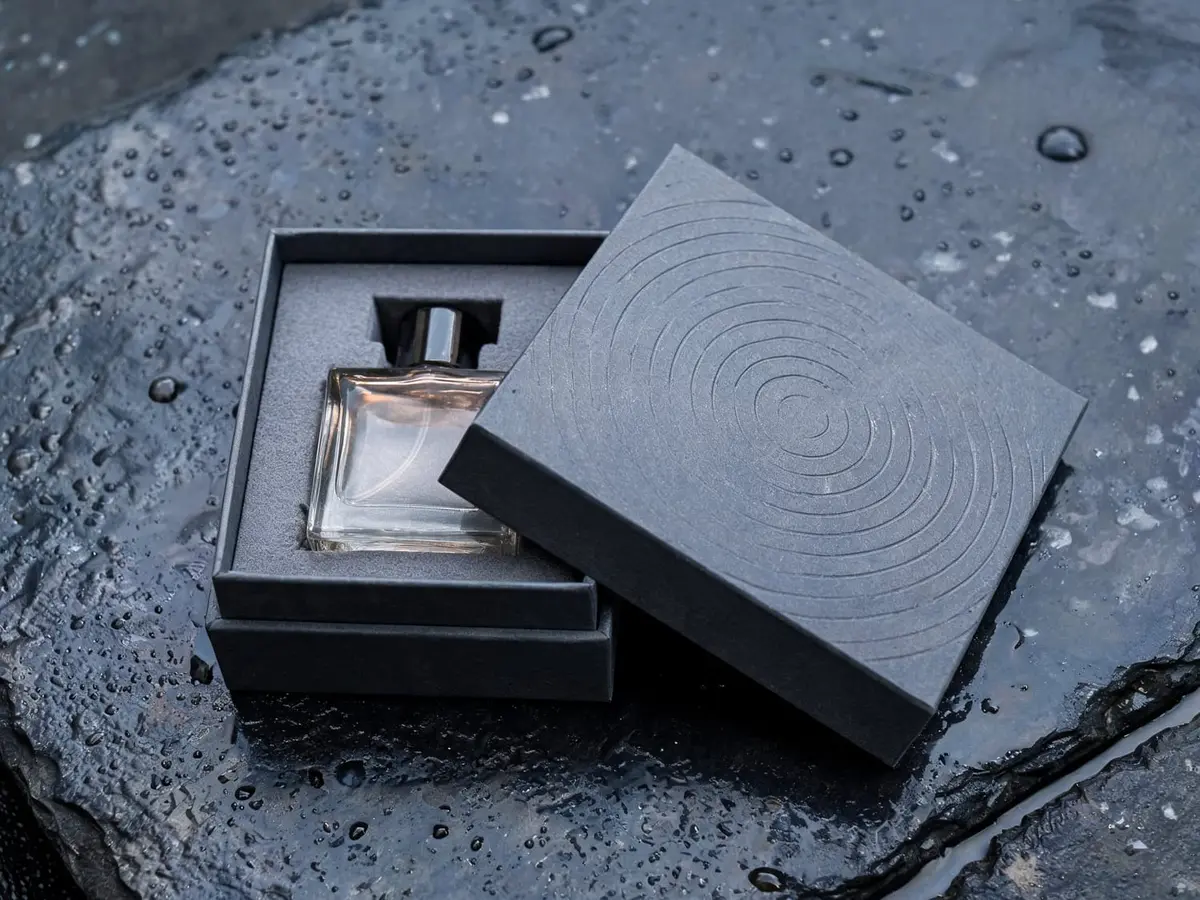
 Maison OndéeAn identity for a Paris perfumer that bottles one thing: rain, at five different weights.PN.26.002. Logo files, Brand book PDF.
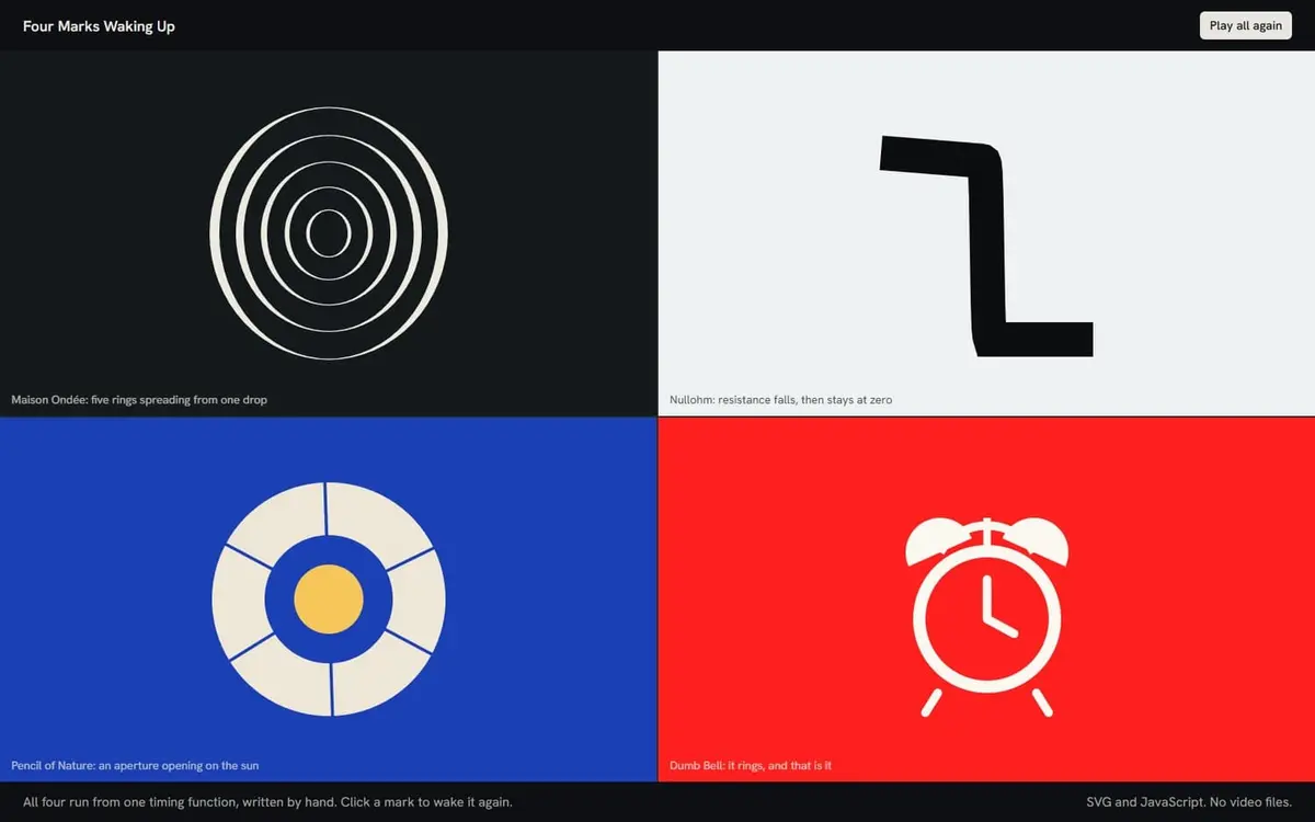
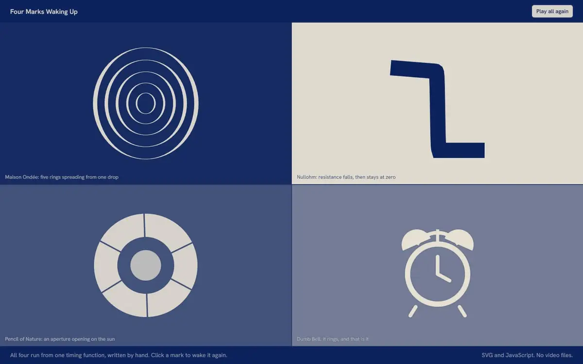 Four Marks Waking UpFour logos from the library, each given one way of coming to life that could only belong to it.PN.26.034. Logo animations.
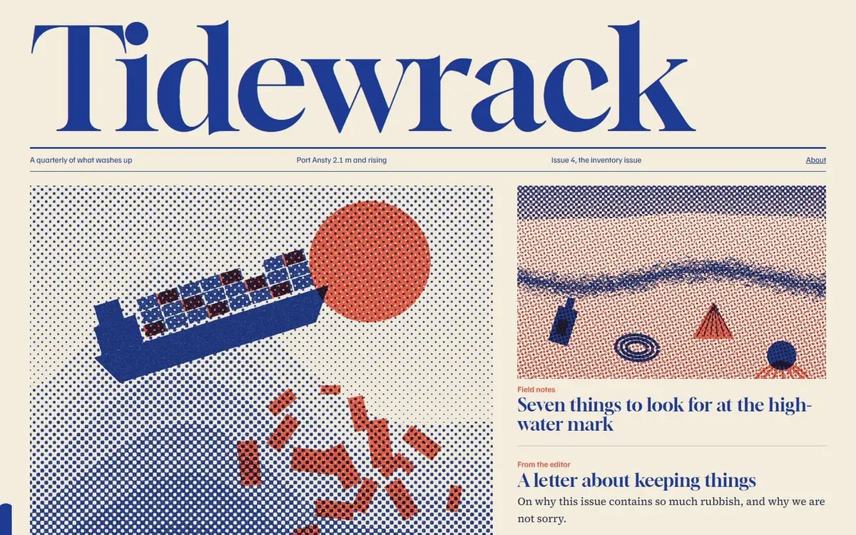
 TidewrackA quarterly about what washes up, with a long read on the Lego that fell into the Atlantic in 1997 and is still coming ashore.PN.26.016. Working website, Long-form essay.