PN.26.016. Web. Studio project, 2026.
Tidewrack
A quarterly about what washes up, with a long read on the Lego that fell into the Atlantic in 1997 and is still coming ashore.
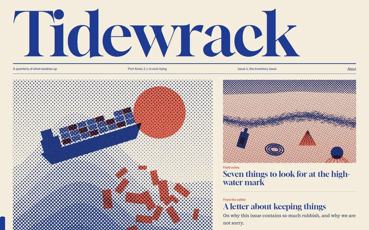
The brief
Build a modern editorial website where typography and writing do the work, and make the reading itself feel designed.
The idea
A magazine about the coast should behave like one. A live tide reading runs under the masthead, and a band of blue rises up the edge of the page as you read, so that finishing an article means the tide has come in.
Decisions
- Everything is set in the two inks of the illustrations, so type and image are visibly from one press.
- Gloock gives the masthead the swagger of a heavy nineteenth-century poster face.
- The tide table is calculated from real harmonic constituents.
- The essay holds an awkward position honestly: I would prefer the octopus not to exist, and I would be delighted to find one.
How it came together
- Researched the 1997 Tokio Express spill and the strandline ecology around it.
- Wrote the essay first and designed the page around its pull quotes.
- Removed two details from the draft that could not be verified.
How it works
Static HTML with hash routing and no framework. The tide is a sum of three cosines. The band up the page edge is driven by scroll position and respects reduced-motion settings.
Want something like this?
Tell us what you are making. A few lines is enough to start.
Hanging nearby
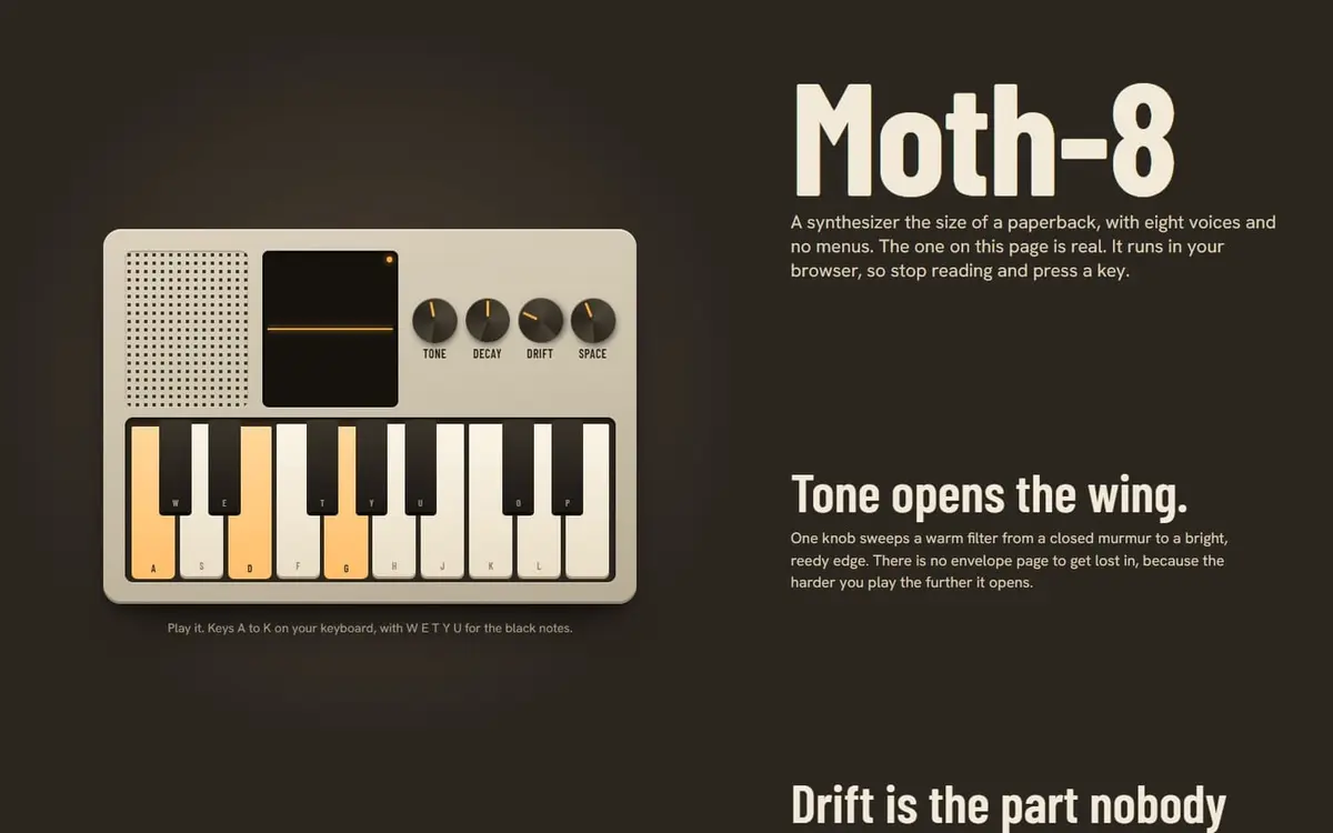
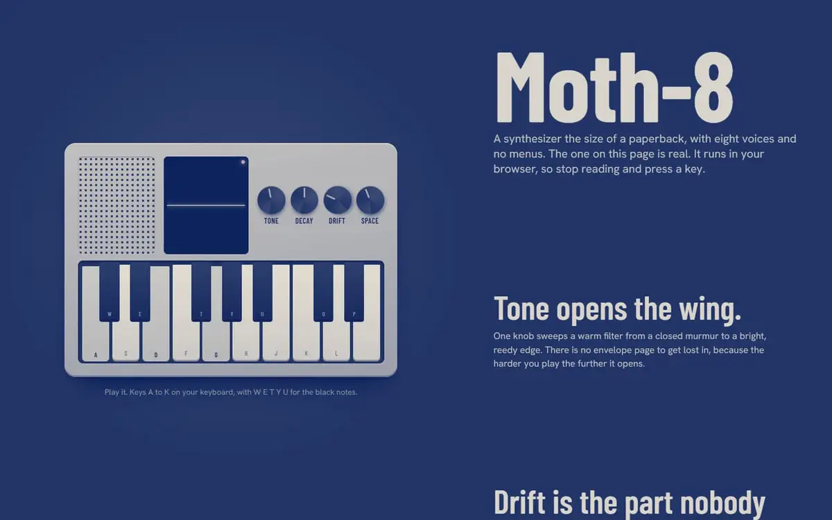 Moth-8A product page where the product is real: a playable eight-voice synthesizer that runs in the browser.PN.26.003. Working instrument, Product page.
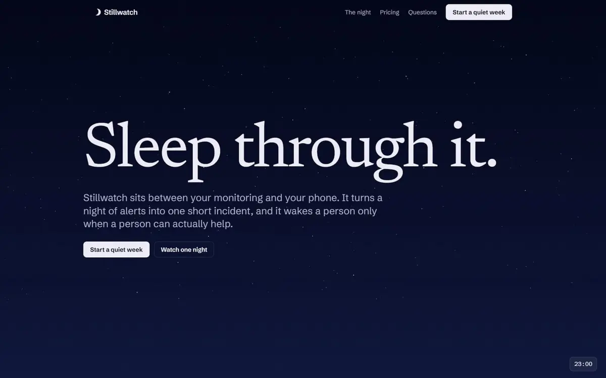
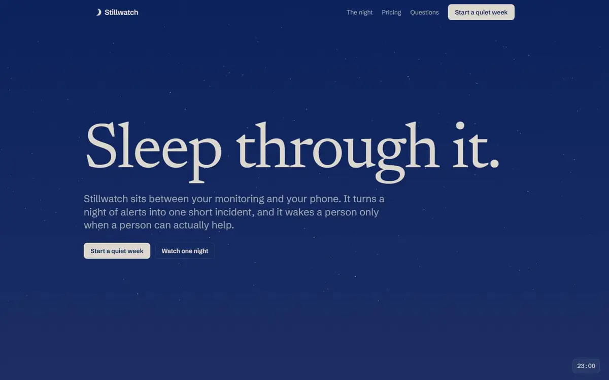 StillwatchA SaaS landing page you scroll through like one on-call night, from 23:00 to a sunrise that flips the page from dark to light.PN.26.015. Working website.
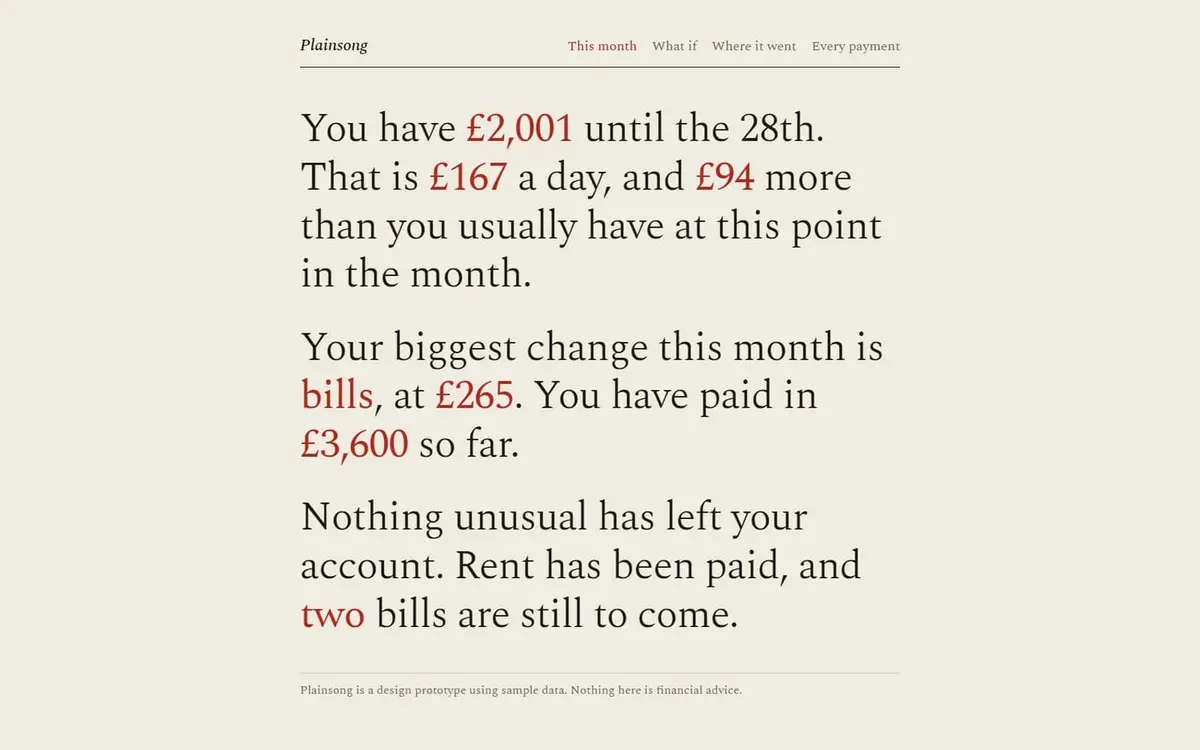
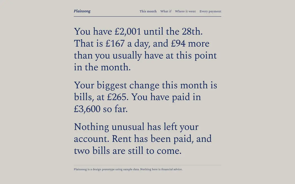 PlainsongA personal finance app with almost no charts. Your money is told in sentences, and any number in red can be dragged to ask what if.PN.26.021. Interactive prototype.